Wednesday, 31 December 2014

CC3C - Challenge 18

Hi all,

This challenge is pocket pages, page 36 of the Compendium of Curiosities.  I decided to try to represent the old year and the new year in my tags as this will be the start of a tag book to include the twelve tags of 2015.


I also took a photo without the page pockets as I couldn't seem to get rid of the glare.


The 2014 tag was covered with some of the Tim Holtz paper from the French Industrial pack and then a piece of the Graphic 45 core impressions card was torn and sanded and mounted at the bottom of the tag.  I added a bit of walnut stain distress ink round the tag and across the torn edge and to finish the background I also added a little tissue tape for some interest.

I die cut the Weathered Clock from silver mirri card and distressed it with Tims sander, then added a little black soot distress ink to give a battered look to the clock.  I mounted it off centre so that I could use the other part on the 2015 tag later.  A couple of clock embellishments and one of the clock hands from the weathered clock die finished the tag.

The 2015 tag was covered in one of the papers from the wallflower paper stash and I used the Tim Holtz stencil Rays with versa mark ink and gold embossing powder to give the impression of sun rise.  

I then cut a bottle shape from card and coloured it with evergreen bough distress ink and embossed with two layers of clear embossing powder to give it a good sheen, to give the impression of the champagne in the bottle I used some gathered twigs distress ink on the reverse and it gives a lovely shadow.  The label was cut from the apothecary bottles die and coloured with tarnished brass distress ink.  The two glasses were cut from acetate and a layer of gold stickles was used for the champagne, this also stuck the glasses to the tag, job done!

To add a little frivolity to the tag I cut a tiny cork from card and used a little piece of wire to make it look as if it was shooting out of the bottle.  A few very small silver nail heads were stuck around the cork to look like the fizz, also over the glasses, after all what is New Year without Fizz!

Thank to Linda and the crew for their inspiration, which you can view here.  Also thanks to The Funkie Junkie for sponsoring this challenge.

Finally Happy New Year to all and lets hope the next year is filled with more great crafty challenges.

Lyn

Thursday, 18 December 2014

CC3C - Challenge 17

Hi all,

Woodlands and Tinsel twine is this challenge so onto page 60 of the compendium of curiosities.   I didn't have any tinsel twine and couldn't get any as my local craft shop had sold out so its just the woodlands for me!


I decided to use a canvas but turned to the backside so it was like a shadow box.  I covered the sides and edges with some of the Postale tissue wrap and then painted over with Turquoise Paperartsy Fresco Finish chalk paint and some white gesso.  Once this was dry I added some snow to the bottom edge and again set this to dry.

The background was a piece of card  that I stuck strips of tissue wrap to and then painted with broken china and spun sugar distress paint and overstamped snowflakes with white gesso once the paint was dry.  I then used a stencil to add Santa and his Sleigh with versa mark ink and then embossed with black embossing powder as I wanted a really dark image.

The houses were from Tando and are made from thick cardboard. I painted them using more Paperartsy fresco paint in Cherry red, Pea coat and Turquoise and Green gold Decoart acrylic paint.  Once the paint was dry I assembled the houses and added them to the piece.

I coloured the trees using Tims technique and added some snow to them.  These were added to the piece once everything was dry.  I then added some more snow around the base of the houses and trees and onto the roofs of the houses.

I painted some flourishes with Decoart liquid gold acrylic paint to get a lovely soft gold finish and attached them to the frame.  Using the Signmaker Alpha Parts I put the text at the top of the frame.  This piece will now be added to our decorations in the living room, I think!

The Curiosity Crew has provided some stunning examples of this technique and you can see them at Linda Ledbetter's blog so click here to see this fabulous work.  Also thanks to the Inspiration Emporium for sponsoring this challenge.

A very Happy Christmas to all and all the very best for 2015.

Lyn

Tuesday, 2 December 2014

CC3C - Challenge 16

Hi all,

This challenge is the Layering Stencil, Embossing technique from page 50 of the Compendium of Curiosities.  I'm trying to get into the Christmas spirit so here we go:


I used the technique with the Christmas stencil to add the word believe, then using some pine needles distress ink to add the holly. To enhance the holly I used a micron pen to outline through the stencil.

I added festive berries and pine needles distress ink to my craft sheet and spritzed with water then smooched the tag through the ink puddle.  I then went round the edges of the tag with a little more festive berries distress ink and walnut stain on the very edge just to give a little more definition to the tag.

Using the Christmas stencil I added the words merry and season with walnut stain distress ink.  I then stamped the happy holidays sentiment from the Tim Holtz Tree Blueprint set and stamped the tree above the sentiment.  I also stamped the tree three times onto some spare card stock with pine needles distress ink and blended out the ink with a damp paint brush.  The tree was then decoupaged onto the tag, and the baubles added.  Instead of the stamped loop to hang the baubles I added a wire loop to each bauble.  A silver star decoupaged on the top of the tree completed this part of the tag.

Taking one of the woodland wreaths I spritzed it with shabby shutters and evergreen bough distress spray stains and set aside to dry.  Once it was dry I added some red gems, a decorative bow and dabbed on some DecoArt snow-tex and , when dry I stuck the wreath onto the tag.

A messy bow of seam binding coloured with evergreen bough distress spray stain and some charms finished the tag.

As usual the curiosity crew has provided some fabulous inspiration for this challenge, click here to browse this wealth of wonderfulness. Also thanks to The Funkie Junkie Boutique for sponsoring this challenge.

Lyn

Tuesday, 18 November 2014

CC3C - Challenge 15

Hi All,

Challenge 15 - Cabinet Cards.  I didn't have any of these so I hastily ordered some and now I'm wondering why I didn't spot them earlier.  I had great fun with this challenge as I dug out the bag of old photos that I got from my Mum.  I photocopied the original onto photo paper to use in this project so that I still have the original, just in case!


Now I have a confession to make, my husband said that Caitlin, my daughter, would like this as she doesn't have any photos of herself at age 2.  This still won't help as this is Me!  He didn't realise that this was not his daughter, although at that age we are quite similar,  made me laugh anyway.

To make my cabinet card I inked round the aperture and the edges with walnut stain distress ink. I then stencilled some multi sized dots, using gold embossing paste, onto the sides of the card and covered with glitter and set aside to dry.   When the paste was dry I drew a little loop on each circle  to make them into baubles.  

 As the photo was a little small for the card I cuts some patterned paper to size and cut an oval, smaller than the one in the cabinet card, inked with walnut stain distress ink, and placed the photo behind it.  On the back of this I put some plain card which I will write a message to my daughter on.

For embellishments I cut some of the Festive Greens in various shades of green and also added some pine needles distress ink to give some shading.  I also inked through the holly die to get the veins in the leaves.  I also added a little snow using DecoArt snow-tex to the edges of the branches.

The stocking and present at the bottom are metal charms that I painted using Pebeo Vitrail paint to give a stained glass effect then added some of the Ranger Mixatives in metallic silver and gold to highlight the details.  The bells in the top corner are from Tims Christmas adornments.  I painted this with various alcohol inks and the gold mixative.  A messy bow made with vintage red organza ribbon was mounted on the foliage then the bells added on top.

The large bauble was cut from textured gold card and mounted onto some red card that I had sealed with matt glue and seal.  I then filled in the red parts with the Pebeo Vitrail paint to give a glassy look to the bauble, before the paint dried I sprinkled a few red micro beads into the gaps for some extra texture and finished with a small bow.

As this was taken the Christmas I was 2, I still remember the teddy, I decided to title it Christmas Past.  I used the Holiday words dies to cut the word Christmas from the same textured gold card as the bauble and the letters for "Past" from green card and stuck them on the bottom.

As always thanks to Linda for organising the challenges, check out the inspiration here from the Curiosity Crew, and a big thank you to Inspiration Emporium for sponsoring this challenge.

Lyn

Sunday, 9 November 2014

12 Tags of 2014 - November

Hi All

First of all Thanks to all those people who visited my blog and especially to those who commented.  Having just about got over the shock of being chosen last month, (my husband scraped me off the ceiling!)  its time to do the next tag for November.  This is an autumnal tag using those lovely rich fiery colours.


I smooshed spiced marmalade, barn door, crushed olive and rusty hinge distress paints onto my craft sheet and spritzed with water and then dragged my tag through the paint, as I got a bit carried away with the amount of paint I had enough for three tags so some for another project.  Once the paint was dry I used the speckles stencil to put some versa mark ink onto the tag then used the sticky clear embossing powder to get some sticky patches on the tag and then rubbed the gold transfer foil onto the sticky patches.

The tag was then embossed with the embossing folder from the layered leaf, with a little vintage photo ink on the folder before embossing to give a bit of shadow.

Having just had a delivery yesterday I happened to have a cardboard box that I could grab to alter, usually my husband is the recycling ogre and nothing is allowed to stay in the house if its not to be used immediately.  I have hidden the rest of the box just incase I need some more cardboard, shh! don't tell him!  I stripped off some of the surface of the cardboard and then inked with walnut stain distress ink.  I then splattered with both the walnut stain and tarnished brass distress sprays.  I love these sprays but I don't half make a mess!  I then cut the tattered leaf from the cardboard.

Having gone round the aperture with walnut stain distress ink I glued cardboard, centering  the aperture over the embossed leaf on the tag and cut the cardboard to match the tag.  I then went round the edges and some of the exposed ridges with some Pebeo empire gold gilding wax for a subtle sheen.

I then looked at the leaf that had been cut from the cardboard and couldn't bear not to use it, so I inked with a little spiced marmalade and barn door distress stain to give a hint of colour.  I wanted it to look like a leaf that had been lying on the ground for a few days.  I then put it in the embossing folder,   having swiped with burnished brass distress stain first, and embossed it.  The stain gave the type of sheen you get from some woodland moulds.  I then attached it to the bottom of my tag as if it had just fallen there.

To finish the tag I added some twine to the hole at the top and some remnant rubs, then wound some glitter twine round the tag with a philosophy tag attached.  A little bit of picket fence distress stain on the tag made the word a little easier to read and some gold bead string was added.

I love the colours of Autumn but hate the fact that the wet and windy weather is not far away.  I think I'll just stay indoors and craft, seems good to me.

Lyn

Thursday, 6 November 2014

CC3C - Challenge 14

Hi All,

This challenge is coloured crackle, see page 53 of Tims Compendium of Curiosities.  At a recent craft fair I purchased some Christmas 'Words'  These are made of MDF and have a small stand so they can be used as table decorations, this seemed the perfect technique to alter them so here we go...


So, I first painted the word and the base with white gesso then, using a combination of dusty concord, salty ocean and broken china distress paint I crackled and coloured using the coloured crackle technique.  Once the crackle was dry I fixed the word to the base.  I seem to have got quite a nice crackle this time, I think it depends on the thickness of the product.


Using some of Tims woodland trees I coloured them using the evergreen bough distress spray, turning my fingers green at the same time, and left them to dry.  When the ink was dry I used a sort of dry brushing effect to put some snow on the trees, I also added a little glitter before the snow was dry.

Once all the pieces were dry I added the trees and a snowman, that I had on the Christmas cake last year, and a small robin to the piece.  Then I added more snow round the base of the pieces, trees and snowman and alone the tops of the word as though it had been in a snow storm.

I painted some chipboard snowflakes with broken china distress paint and sprinkled some glitter into the paint before it dried just for a little festive sparkle.  These were then added to the word here and there.


This is the first of my Christmas preparations done but I now know what I'm going to do with the other two word plaques that I purchased, Noel and Santa.

As usual there are some stunning examples from the Curiosity Crew, Thanks Linda for the chance to see such fabulous work.  Also thanks to The Funkie Junkie for sponsoring this challenge.

Right where did I put the  distress crackle paint....

Lyn

Saturday, 25 October 2014

12 tags of 2014 - October

Hi all,

I love this time of year, all the warm colours of the leaves, (much better than just green!) and misty mornings.  Although we don't make as much of Halloween in England I do like all the imagery and definitely the colour scheme.

I decided that you cannot have Halloween without witches so I wanted to put one on my tag, the witch on Tims Carved Halloween stamp set was perfect but as she is on a broomstick she has to fly!

 After stencilling the spooky words with grunge paste I set the tag aside to dry.  From the Carved Halloween stamp set I stamped the witch, pumpkin and two spiders onto some spare card.  The spiders were embossed with clear embossing powder and cut out, quite a labour of love I can tell you.  The witch and the pumpkin were coloured using distress markers.  The pumpkin was then triple embossed with clear embossing powder cut out and some dimensional tape put on the back.  The witch was cut out, her pumpkin lantern and boots were embossed with clear embossing powder and a long narrow strip of acetate attached at the top of her hat.

I then die cut the cobweb decorative strip using some black card and swiped the picket fence distress stain over the whole thing waited a couple of seconds then dabbed with a tissue to get an uneven finish.

I then took the dry tag and spritzed with wild honey, barn door and dusty concord distress spray stain and dried with a heat gun.  I then sanded lightly over some of the grunge paste letters to get some of them a lot lighter.  A light dusting of walnut stain distress ink over some of the other letters to give variations in tones and I then inked round the edgers of the tag with the same ink.

I attached the various pieces to the tag and attached the other end of the acetate strip to the bak of the tag so the witch looks as though she is flying across the tag.


 A few small text sayings and a bat from the Apothecary remnant rubs completed the front of the tag and a piece of crocheted black ribbon tied at the top to complete the tag.

Thanks Tim for the inspiration and hope you like my interpretation.

Lyn

Thursday, 23 October 2014

CC3C - Challenge 13

Hi all,

What a week, in fact what a fortnight, I was asked to make the wedding invitations for some friends wedding and today I finished them, phew.


So onto the challenge,  Ive had this IndegoBlu Christmas stamp since last year and I just love it, I think it will be on all my cards this year if I ever get round to making them!  I decided it had to go onto the book front as I'm going to try to do some Christmas Tags this year and will need somewhere to put them.  So here it is:

I stamped the sentiment into the panel on the front of the cover and coloured the stag at the top, then decided to colour the fancy panels on the cover too.  I then added some gems to the corners of the panels.

I then die cut some trees and a lamp post, added some snow using a white pen, and attached them to the cover.  Some sons flakes die cut from silver mirri card were also added to the cover.

A selection of ribbons with some festive charms were threaded through the holes in the side of the cover.  I intend to do something with the inside but time has caught up with me so that is a job for another day, perhaps over the Christmas period.

Many thanks again to Linda Ledbetter for continuing to inspire along with the Curiosity Crew  and to the Inspiration Emporium for sponsoring this challenge.

I am now going to lie down in a darkened room with a very large glass of red wine after a very fraught two weeks!

Lyn

Wednesday, 8 October 2014

CC3C - Challenge 12

Hi All

This challenge is all about Distress Photo Tinting, see page 41 of Tim Holtz Compendium of Curiosities. I have really enjoyed this challenge as I had to get out all the old family photos to choose one to use for my entry.  I decided on this photo of my Mum, she is wearing a dress that she made, to impress my Dad I think.  She was always sewing when my sister and I were little,  if we saw a dress we liked out came the sewing machine and we were wearing her version of that dress the next day.  My sister has followed her down the sewing route as she is now a fashion designer with her own company but although I can sew I prefer to play with ink and paper and card.

Anyhoo on with the challenge


I checked with my Mum who said the leaves on the dress were shades of green so I used peeled paint and shabby shutters, I  photocopied the original onto glossy photo paper as I didn't want to damage it.  I then cut the photo using the Spellbinders set Grand Labels Four and made a faux nestie out of kraft card which I then coloured with barn door, picked raspberries and ripe persimmon distress inks and then edged with walnut stain and mounted the photo onto the matt.

The background is a canvas panel that I sprayed with delusions inks and then used the Tim Holtz stencil Splatters with some grunge paste to give a little texture.  Once the paste was dry I inked over the stencilling and round the edges of the canvas with walnut stain distress ink.  I then wrapped some thin twine in three shades of green round the canvas and mounted the photo onto the twine.

I die cut several sewing items and distressed the edges with walnut stain distress ink, wound some green embroidery thread round the bobbin  and added some black soot distress paint to the sewing machine.  The scissors were cut from silver mirri card and sanded back then some black soot distress ink rubbed into the sanding and a little gold gilding wax added to the edges.  I added mini fastener to make the hinge.  These items were all added to the panel using silicon glue for added depth.

I die cut some pins from silver mirri card and added them and some die cut stitches to the panel.  I used some chipboard letters from my stash to spell out Mum and added some stamping and distress inks before adding them to the panel and covering with glossy accents.

I'm going to give this to my Mum for the photo gallery she has on her sideboard in the lounge, I think she'll like it.

Thanks to the Curiosity Crew for all their inspiration, you can check this out on Linda Ledbetters blog, there are some wonderful examples of the technique shown there.  Also thanks to The Funkie Junkie for sponsoring this challenge.

Lyn

Tuesday, 23 September 2014

12 Tags of 2014 - September

Hi all,

This months tag is to do the faded background technique in a different way, see Tim Holtz blog for the method.  I think this is easier and gives a better effect with paler colours.


I used the Harlequin stencil and aqua alcohol ink then overstamped the images. The raindrops are from a Sheena Douglas stamp set and I used the second generation image as I didn't want them to be too dark.  The large raindrops were punched from a piece of card coloured with red pepper, purple twilight and sunset orange alcohol ink with a little gold mixative.

I mounted the glossy card onto a tag and carried on stamping the raindrop stamp onto edge then went round with walnut stain distress ink.  The large raindrops were attached with foam pads for a bit of dimension and the tag was finished off with some string that I frayed after knotting it.

Lyn

Monday, 22 September 2014

CC3C - Challenge 11

Hi all,

This week is an odd week as my daughter Caitlin went to university on Saturday and the house has felt very quiet ever since.  This is odd because when she was here she was usually plugged into her computer with her head phones on playing league of legends.....go figure!

Anyway when it came to planing this challenge I found myself a little sad and I always think these masks look sad so here we go.


I covered the mask in white gesso then when dry covered it using the Tim Holtz Postale tissue wrap.  I then used walnut stain distress ink to grunge it up a bit.  As I haven't any of the new distress ink sprays I made my own using some walnut stain reinker and a mini mister.  I made the spray ink very weak as I wanted it to run and sploge but not obscure the text.

I stamped the IndigoBlu image, Blazing Poppies onto tissue and coloured with alcohol ink pens and then attached one to the bottom right of the mask and one to the top left.  I then made some roses using Tims tattered florals die and edged them with walnut stain.  The roses were added over the stamped flowers and I also added some tiny pieces of dried Babys Breath that I had in my stash.

The technique for this challenge was then used on the butterflies and the skeleton leaves which were then added to the floral sprays.


As I said I find these masks sad so of course I had to add the tear drops which were clear so I coloured them with a black alcohol pen.

Thanks to Inspiration Emporium for sponsoring this challenge and of course to the crafty crew for all the inspiration, click on the link to see their wonderful creations.

I know that Caitlin is going to have a wonderful time at university but it will take time to get used to her not being here, so onto the next crafty challenge!

Lyn

Thursday, 11 September 2014

CC3C - Challenge 10

Hi all,

Well into double figures, what fun!  This challenge is the Assemblage Clock.  This was nearly the challenge too far as I didn't have a clock and when I ordered one they said the delivery date may be the end of September, however I managed to find one else where so I will have another one to do later....YAY!

Any excuse to buy more stash, I've even had to go to a certain Swedish store for more storage solutions.  You can only put up with so many avalanches when you open a cupboard door!!!!

Hey Ho to work, Having just had my daughter Caitlins' 18th birthday I had lots of Alice in Wonderland stash spread over the workspace, (well I say space, think 12inches by 12 inches) so I thought rabbit holes, as you do, and this is what I came up with.


I prepared the clock using IndgoBlu English Cottage acrylic paint using brown for the outside of the clock case and bright red for the bells on the top.  I then painted white spots onto the bells and...instant toadstools (for the caterpillar of course).


I didn't paint the handle as I  covered it with ribbons and the small playing cards, the Queen of Hearts of course.  The grass is some green card stock that I over inked with evergreen boughs distress ink and stuck to the front of the clock.

The decoupage sheets were from House of Zandra, the inside panel is Alice with the bottle saying Drink Me and the White Rabbit is on the outside.


To finish the project I added some roses made using the  Tim Holtz  tattered flower garland die and printed a banner, edged it with a little evergreen bough distress ink and attached it at a jaunty angle.

So far about half of the projects that I have made for the various challenges my daughter has said she is taking to University to decorate her room with, this will be one of them!

Many thanks to The Funkie Junkie for sponsoring this challenge and of course to the excellent Curiosity Crew for all their crafty inspirations.  This has been a great challenge!
Lyn

Sunday, 31 August 2014

12 Tags of 2014 - August

Hi All

What a month, had a fab holiday in the US, Las Vegas, San Francisco and New York, my daughter's 18th birthday and her A level results and the realisation she is going to university in 20 days time!!!!
And breathe!

It's no wonder I'm a little late with my attempt at the tag for this month but here we go.

As I haven't had much of this this month, I chose a Time theme.  I stamped the two sentiments with archival ink, both are from Tim's stamp sets and then stencilled some 'coffee rings' using grunge paste and an unidentified stencil I found in one of my boxes.


Once the paste had dried I used dusty concord, shaded lilac and broken china distress stain to marble the tag and to filled in the gaps with a little more broken china.  A brisk rub with dusty concord and a distress tool around the edges and the colour was done.   I like the way the grunge paste resists the ink to a degree giving a faded look to the 'coffee rings'.   Any stain left on the non-stick craft sheet was mopped up with some seam binding.

I die cut the Weathered Clock from Engraving Art copper board and rubbed with Tim's sanding tool to reveal the metallic copper core.  The good times banner is some acetate that I put through an embossing machine with the Authentic set of shadow press words.  I then rubbed black soot distress paint across and wiped off the excess so the word popped out.  This was then attached to the tag with staples.

I painted an Ideaology word band with some dusty concord distress paint, again wiping off the excess and attached with some twine.  The seam binding that I dyed earlier was tied in a bow at the top.

Whew, what a month.  I don't think September is going to be any less busy but that's life!

Lyn

Friday, 22 August 2014

CC3C - Challenge 9

Hi all,

This challenge was frames stamps and framelits.  I was quite relieved that this did not come up sooner as I've only just received my sets so ever onwards....


I used the Compass Blueprint set for my tag.  I used water colour card and coloured it using the wrinkle free distress technique and colours spun sugar, faded jeans and peacock feathers.  I then edged the card with faded jeans and a blending tool to give a bit of depth.  I then used a spritzer to add splotches of dusty concord around the outer part of the card.

I then stamped the compass using black archival ink so that the image went slightly off the card.  I then used the required technique to get the centre of the compass in both textured silver card and gold mirri card.  These were then decoupaged onto the water colour card.

The text was stamped onto a piece of scrap card with the outline and die cut in the same way and mounted onto the card with 3D foam.  A key with the word Life was sewn to the card.   To give the water colour card more definition  I went round the edges with a silver Krylon pen.  The water colour card was mounted onto a tag that had been edged with dusty concord.

A pointing hand from a Tim Holtz ephemera pack was added to the top of the tag with 3D foam.  I then coloured some seam binding with the same inks as the card and added a loop of ribbon to the top of the tag.

Whew that was a bit of a rush as we have been on holiday till Thursday, in America so lots of new inspiration, so I wasn't sure I'd get it done in time.  Well here it is hope you like it.

As usual thanks to Linda for hosting this lovely crafty extravaganza, look here for some fantastic examples from the crafty crew and to Inspiration Emporium for sponsoring the challenge.

Lyn


Wednesday, 6 August 2014

CC3C Challenge 8

Hi all,

Challenge 8 is the faded layers from page 58 of the Compendium of Curiosities.  This always challenges me as I'm not sure is I'm getting it right but here goes!


I coloured the coated card with currant, terra cotta and raisin alcohol ink then used the Tim Holtz stencil crocodile to produce the faded layer effect.  This was then echoed on the other side of the card with picket fence distress stain.  The dragonfly blueprint stamp and the small butterfly stamps were stamped in black archival.  The wings of the stamped dragonfly were coloured with a mixture of citrus and sail boat blue alcohol inks.

The large dragonfly was cut from textured silver card using the Tim Holtz die layered dragonfly and coloured with the citrus and sailboat blue alcohol ink as before. The wings of the dragonfly were cut from acetate using the same die and embossed using the corresponding embossing folder then coloured with the same alcohol inks.


The body was some some 'novelty' stickers I had in my stash and I like the oil on water look they had.

I finished with the sentiment and a word band from Idea-ology.  I swiped the band with picket fence distress stain to pick out the words and cleaned off the excess, then attached it using some pink twine.

Thanks to The Funkie Junkie for sponsoring this challenge and of course to Linda for starting this creative madness in the first place! Such Fun!

Lyn

Wednesday, 23 July 2014

CC3C challenge 7

Hi All

This challenge is the painted industrial from page 46 of the compendium of curiosities.  I really enjoyed this challenge and came up with something whimsical...a birdhouse!


I stuck some self adhesive metal sheet to some kraft card and then die cut the roof using the Sizzix die Susans' Garden.  The other elements of the birdhouse were cut from kraft card.  I then followed the instructions on page 46 to prepare my roof.  The walls of the birdhouse were embossed with the Sheena Douglas embossing folder wood panel.  I then used a little vintage photo distress ink to bring out the wood grain.

I had cut the bird from the Tim Holtz die caged bird but then spotted the bird on one of the quarter size papers in the wallflower paper stash and decided to use him instead so I stuck him to the die cut bird and trimmed the excess, to give him a little more strength.

The roses were made from the rest of the quarter paper from the wallflower paper stash using the reverse side, a little worn lipstick distress ink and the tattered pine cone die.  The leaves were cut using the garden greens die and grunged a bit with walnut stain distress ink.

Every self respecting house needs a chimney and in keeping with my woodland theme (?) I decided it would be a toadstool.  Just a roll of kraft card for the pipe, painted with picket fence distress stain.  A circle cut from kraft card and stained red with festive berries and some white spots drawn on then made into a cone and stuck on the top.


Thanks to Linda for all this crafty fun doing these challenges and to Inspiration Emporium for sponsoring this challenge.  Hope you like it.

Lyn

Friday, 18 July 2014

Just for me!

Hi all

This is a piece that is not for a competition but just for me.  I went to a workshop recently held by Country View Crafts and led by Brenda Brown where we explored these little bottles of wonderfulness.....Dylusions ink sprays.

We learnt various techniques and then did our first art journalling page in a lovely new journal.  I love a new book, don't you, lots of pages to fill.  Well yesterday I decided to go solo and start my own art journal journey!


I also tried out zentangle for the first time on this page.  The sentiment is from the Tim Holtz Stampers Anonymous set 'Good Thoughts' which I stamped onto cream card then cut into single words and edged with a black pro marker.  Not the most detailed page in the world but for a first solo attempt I'm quite happy.

Lyn

Tuesday, 15 July 2014

CC3C - Challenge 6

Hi all,

This challenge was to use the burlap panels, see page 37.  This was a little difficult as I only had the pack of four small ones and wanted to use a larger panel (I'm a woman and its my duty to be difficult!).  Well I ordered some of the 4x6inch panels and I'm still waiting for the delivery, any hoo!

I used one of the small rectangle panels and some rather nice roses that I found in my stash:


I covered the front and part of the sides with  Melange tissue wrap from Idea-ology, then covered one corner with gesso and left this to almost dry.  When there were just a few damp patches I wiped the gesso with a baby wipe to give a little more texture.  I stamped the image from the Tim Holtz stampers anonymous set classics 14 onto tissue with archival ink.  I then used distress pens to scribble some ink on to my craft sheet, I used spun sugar, shaded lilac and scattered straw.  I spritzed with water as I just wanted a hint of colour and smooshed the tissue into the ink puddle then dried with a heat gun.

I then glued it to the panel using IndigoBlu Slap It On matte and also put a layer over the tissue to seal it.  A light dusting of walnut stain distress ink round the outside aged it a little.  The roses were also dusted with walnut stain distress ink and glued to the panel.  I cut some leaves from dark green card and inked them using versa mark champagne sparkle ink and covered them in clear embossing powder, and stuck them between the roses.  The stems of the roses that I had cut off were twisted round a wooden skewer to make spirals and glued under the roses.

Thanks to Linda for hosting this challenging event and to Funkie Junkie Boutique for sponsoring this particular challenge.

Hope you like it.

Lyn

Friday, 11 July 2014

12 tags of 2014 - July

Hi all,

This month's tag has a seaside theme, (where did I leave my bucket and spade, oh well). I tried Tim's method for making sand and it was really easy, although I didn't have the same colours of embossing powder so I improvised!


I had some glossy card stock so I used this for the background. I used spun sugar, tumbled glass and faded jeans distress ink and brayered them onto the card.  I took a piece of cling film and spritzed it with water then draped it, wet side down, on to the inky surface making sure there were lots of creases in the cling film.  When this was dry, I peeled off the cling film and had a lovely watery background.

I cut some acetate and embossed it using the Sheena Douglas embossing folder Tigerprint, I don't have a watery embossing folder but this looked like the ripples you get in the sun on water, tres cool!


The boat and shells were from the Sheena Douglas stamp sets Sea scapes and Sea shells and stamped on to card and coloured with distress markers then I painted the shells with Pebeo Ice acrylic glaze to give them a subtle shine.

I layered the 'sand' with the shells and the boat and made a sign post with some scrap card, the little bird is a stamp that was on my desk but I cannot remember where I got it.  I finished off with some jute ribbon and a little bit of black twine.

Hope you like it.

Lyn


Tuesday, 1 July 2014

CC3C challenge 5

Hi all,

Curiouser and curiouser, the technique for this challenge is distress watercolouring, page 39 in the compendium of curiosities.  While looking for the stamps I wanted to use I came across this pocket watch from Wendy Vecchi and I went all Alice in Wonderland.  I had bought these stamps from IndigoBlu at the Alexandra Palace Big Stamp Show and was inspired to use them.  They are the Alice I and Alice II sets.


After coating the pocket watch with gesso I embossed some white card using Tim Holtz a texture fade, collage, and cut it into small pieces and glued to the front of the frame.  When dry I used a combination of golden acrylic paints in paynes grey and quinacridone nickel azo gold and some IndigoBlu english cottage acrylic paint in a metallic copper called Miss Moneypenny.  A light application of Pebeo gilding wax, silver, and the frame was complete.  To build up the loop at the top of the frame I used some moulding paste and painted and gilded as before.

After stamping the Alice characters on watercolour paper I used the method on page 39 to colour them then cut them out.  The back of the frame is a combination of mustard seed, vintage photo and walnut stain coloured using the distress watercolour method, I will admit it took a long time to colour this large area but I was quite pleased with the result.  I then stamped with walnut stain distress ink and a crackle stamp from the Sheena Douglass set Ageing Beautifully.


The banner at the bottom was inked with walnut stain, vintage photo and scattered straw and stamped with the crackle stamp in walnut stain.  The sentiment is from the same IndigoBlu stamp sets as before.  This was then mounted across the bottom of the piece.

Many thanks to Inspiration Emporium for sponsoring this challenge, and to the Curiosity Crew for your continued inspiration.  Hope you like it.

Lyn

Thursday, 19 June 2014

12 tags of 2-14 - June

Hi all,

This months tag for the 12 tags of 2014 is using the blended watercolour effect with stencils.  A lovely soft look great with shabby distress.

I decided to go with a time theme as I seem to be very short of it at the moment.  My daughter is finishing her A level exams, she was in a drama school production of Little Shop of Horrors (which finished on Tuesday...it was phenomenal!!!) and is now looking forward to going to university so time is slipping away far too fast, anyway I digress, as usual!


I used the clockwork stencil and inked it with peacock feathers, dusty concord and worn lipstick distress inks and printed the image onto some watercolour paper.  I trimmed the paper to get the nicest bit of the print and tore the top and bottom edges for a more shabby look.  I the used walnut stain distress ink round the tag to highlight the torn edges and added a little scattered straw and tumbled glass distress ink in the middle.


The clock die cut is from Tattered Lace and is actually a grandfather clock but I only wanted the top of it so I cut off the case and then added the hands to the clock face.  A little Pebeo Empire Gold gilding wax was rubbed over the surface to bring out the embossing.  I stamped the 'T' from the Stampers Anonymous stamp set Classics 15 with black archival ink and added a few of the mini gears from ideology.

The ribbon is American seam binding died with dusty concord, peacock feathers and worn lipstick distress inks and I added a pocket watch I found in my stash.  To complete I inked round the tag with walnut stain distress ink and attached the watercolour paper topper to it.

Hope you like it, thanks for stopping by.

Lyn

Wednesday, 18 June 2014

Compendium of Curiosities - challenge 4

Hi all,

As this challenge is all about layering stencils and texture paste, page 49 of the compendium. I began by looking at the stencils I have and couldn't decide which to use (its like trying to choose between your children!), so I decided to pick a stamp and work backwards!


I decided on this beautiful butterfly from the Sheena Douglass set Butterfly Effect.  Now, all butterflies need something to land on so I found the woodgrain stencil and using the technique on page 49 prepared a tag.

Once the tag was dry I coloured it with aged mahogany and tea dye distress inks and splattered with water for a little extra interest.  Then edged the tag with walnut stain distress ink.  The sentiment is from the same stamp set as the butterfly and was stamped in black archival ink.

The butterfly comes as two parts, the 'background' butterfly and the detailing for the wings.  The background butterfly was stamped onto card stock and the detail butterfly onto acetate.  I coloured the background butterfly with the wonderful Silks acrylic glazes from Pebeo but left the acetate clear.  After shaping both parts of the butterfly I stuck them together.

The body was made by winding four pieces of wire round a pencil leaving a long piece at each end.  At the top of the body I twisted all four wires together to seal the body and then separated them to make the antenna with two wires per side.  After filling the body with beads I twisted the wires together to hold in the beads and then fanned the wires out to make the tail and curled the ends just for fun!  The body was then glued to the wings and the whole butterfly was attached  to the tag.

I added some metal leaves and a metal flower to balance the tag and there you go!

Thanks to The Funky Junkie Boutique for sponsoring this challenge, I hope you like my effort.

Lyn

Saturday, 7 June 2014

Girl Talk

Hi all,

Well what a week,we were at Slaley Hall, in Northumberland, last weekend till Tuesday for my Mums 85th birthday.  We stayed in one of the lovely lodges and had a big family Lunch on the Sunday.  This was held in the hotel and we had a fab time, the food was lovely and the company very convivial.  Mum had a lovely time and it was great to have most of the family together for once!

When we got back on Tuesday I caught up with all the blogs I follow and decided I still had time to have a go at this weeks Sunday Stamper.

Now, my daughter is not a girlie girl, she does not like pink and is not over fond of all things feminine.  However she does like steampunk soooo this is what I came up with.  Its not traditionally girlie but she liked it so there you go!


I stamped the background with the sentiments from the Doo Lally Pip stamp set Time Travel by Lindsay Mason with ice Silks Acrylic paint. Then I blended distress ink over the top, the silks act as a resist so there is a shadow of the sentiments in the background.  The distress inks were dusty concord,  tumbled glass, shabby shutters, picked raspberry and a little scattered straw in the middle.  Spattering with water gives a nice splotchy texture and then I edged the background with walnut stain to draw the eye into the middle.

The branches were stamped using black archival ink and are from the Sheena Douglass set A New Leaf.  This is a really useful set cos its branches, leaves and flowers in various sizes so you can make your own foliage.

The geeky girl is also from the Doo Lally Pip set and was stamped, coloured and cut out and set on the branch.  The flowers are from the Creative Expressions set Steampunk Flowers.  I stamped them then painted them using the Silks acrylic paints to give a lovely metallic sheen.  The centres of the flowers are Tim Holtz idea-ology mini gears.  The leaves are cut from silver mirri card using Sue Wilsons Faux quilled leaves die from Creative Expressions.  Two metal flowers from Crafttime were also added.  The whole piece was mounted onto a black matt that I clear embossed the edges of.

So not your typical girlie piece but one tailored to my little girlie (she is 17 but hey...), hope you like it.

Lyn

Friday, 30 May 2014

Compendium of Curiosities 3 - Challenge 3

Hi all,

Challenge number three is the faux tea roses from page 65 of the Compendium of Curiosities.  Ive made flowers using several different methods and this is one of the easiest so far.  The lovely thing about this technique is you can make little tiny ones all the way up to big fat blowsy ones.  Well I set about making the flowers in blue as per the instructions of my daughter Caitlin as she decided that the finished project would be hers!


I used one of the large papier-mâché letters from Hobbycraft and embossed several sheets of white card using the Tim Holtz Riveted Metal texture fade then paper pieced them over the surface of the large letter.  I filled any gaps in the paper piecing with texture sand and allowed some of the sand to go over the surface to give more texture to the edges.  I then gessoed over the whole thing and allowed it to dry completely.

I painted the whole thing using a wash of paynes grey acrylic paint, then deco art quinacridone gold, this stuff is like liquid rust,  allowing the piece to dry between coats.  The next layer was a wash of deco art traditions blue green light again allowing this to dry.  Once this was dry I dabbled with neat  quinacridone gold and paynes grey to give more depth around the edges. Once this was dry a little dry brushing with gesso and I was a happy bunny!


The texture sand around the edges has given a lovely eroded look to some of the piece and the embossing shows really well with the dry brushed gesso.

The roses needed some foliage so I used the Tim Holtz die Garden Greens but trimmed all the leaves to make lots of thorns, these were cut out of textured silver foiled card along with some of the leaves from the tattered pinecone die.  Once I had attached the 'twigs' I placed the roses amongst them.  I also added a few metal leaves amongst the roses for a little more texture.


I think this has been my favourite challenge so far as I'm really getting into antiquing and rust at the moment, thanks again Linda for setting up these challenges, and thanks also to Inspiration Emporium for sponsoring the challenge.

Lyn

Saturday, 17 May 2014

Compendium of curiosities challenge - challenge number 2

Hi all

Challenge number 2 is distress glitter, page 56 of the compendium .  Now,  as lots of people seem to be saying glitter is not really my thing, but distress glitter is a very soft glittery sparkle not all out in your face, so I must admit a liking for it.  However as I don't use it often I don't have many colours so I decided that the easiest way to do this would be to use inked or coloured card stock and rock candy distress glitter and then to ink over the top of it.  So here we go,


The MDF owl on a branch is from Pronty.  I covered the owl with paper from DCWVs' Teen Prints paper stack and added his chest from the same paper stack.  The eyes are some watch embellishments I found in my stash and I've backed the eyes with some cogs that I cut from black card and lightly rubbed with Pebeo gilding wax in both gold and silver,  I love this wax as its really soft and easy to apply and you can buff it to a lovely metallic shine after its applied.

The branch was covered in brown card that I embossed using the Sheena Douglas embossing folder Wood Panel, I also highlighted the embossing with walnut stain distress ink.  The leaves were covered with green card then I die cut leaves in a darker green using Sue Wilsons die set Fern Trio.  Some of these leaves were then covered in rock candy distress glitter and a little evergreen bough distress ink added to the ends of the leaves for a bit of depth. These were then attached to the twig.

The roses were made from papers in the Docrafts paper pack called Chronology.  I cut various flowers using Tim Holtz tattered florals die and Sue Wilsons classic rose die.  I then made them into 3D flowers and 'sugared' them by dabbing them with glue and scattering rock candy distress glitter on them.  These were then attached to the branch at the tops of the leaves.

A few more cogs scattered amongst the foliage finished off my piece, I may add some ribbon to the back so I can hang it on the wall.  Thanks to The Funkie Junkie Boutique for sponsoring this challenge and to Linda for hosting the series.

Lyn

Wednesday, 14 May 2014

Sunday Stamper 307 - Pink!

Hi all,

This weeks challenge from Hels Sheridan was to create a piece including pink, not my natural 'go to' colour but I had a go.


I couldn't find a manilla tag so had to go with a kraft card one and the pale pinks seemed to disappear into the background, that is until I remembered that Picket Fence distress ink is opaque.  I swiped the ink over the tag and dried it with a heat gun so I then had a patchy white surface to play on.

The background was done with victorian velvet, spun sugar and picked raspberries distress ink (is is just me but I always want to call it pickled raspberries for some reason!).  I then stamped with picked raspberries using the small harlequin stamp from the Tim Holtz collection Mini Muse.  The sentiment was from the Tim Holtz collection Mini Ornates and stamped in black archival ink.

I then used the Rivited Metal set texture fade to emboss a piece of the Tim Holtz idea-ology metal  sheet which I cut along some of the embossed lines to give two small sections.  To grunge up the metal I swiped it with black soot distress ink and dripped a little black alcohol ink to give a few spots,  and then attached them to the tag.  The flowers were from Hobbycraft but they were white so I decided to spray them with Apple Blossom Radiant Rain shimmering mist from Luminarte.  This gave a lovely variegated colour to the flowers and also my hand!! (I think I missed the flowers)


I then cut some leaves using Sue Wilson's Faux Quilled Leaves die by Creative Expressions and separated them into small sprays.  The flowers and leaves were then grouped over the metal to soften the edges. Loops of pink string were also added.

To finish the tag I dyed a piece of white seam binding with spun sugar distress ink and added this with some black seam binding and more pink string to the top of the tag.

Lyn

P.S. I am pleased to report that the ink finally came off my hand, it only lasted 5 days!


Saturday, 10 May 2014

12 Tags of 2014 - May

Hi all,

Another day, another challenge, this time Tim Holtz 12 Tags of 2014.  This month the technique was a tiled tag and to incorporate some of the treasures we collect along the way.  I'm sure these treasures are only for looking at not actually to USE!, but no! Tim wants us to use them and actually open the packets....oh the will power!

So, here we go....

The base tag was coloured using weathered wood, peacock feathers, and broken china distress stains using the wrinkle free technique.  I then rubbed picket fence distress stain over the top to calm down the colours a bit, I also splatted the picket fence to give some nice white splats but then covered them up with the focal elements, oh well it did look good but ...

The various tiles were cut from one of the sheets in the French Industrial paper stash, these were distressed around the edges and inked with combinations of peacock feathers, spun sugar and a little walnut stain distress ink.  The buttons, cotton reel, dress form, needle and pins were all cut using dies and variously inked, stamped and embossed as above.

The scissors were originally brass coloured but a bit too dark for the tag so a little silver pebeo gilding wax was added making them look suitably shabby. The thread was a freebie from some magazine and was green and white stripes, so out with the peacock feather distress ink and voila! green thread (also green fingers..no, nothing to do with the garden!).  A little teal seam binding and more green thread finished off the tag and was held in place with a Tim Holtz wire pin, safety pin to us Brits.

All works of art need a title so a cute little "Tres Chic" stamp finished my tag.

Hope you like it.

Lyn

P.S. Yes I know I only used two embellishments from my stash, what can
 I say "they are my precious-es"

Tuesday, 6 May 2014

Sunday Stamper Week 306

Hi all,

Now that the Easter holidays, university finance applications, end of financial year, and a humungous pile of ironing are out of the way I can get down to some serious crafting.  This is my latest effort for Hels Sheridans Sunday stamper challenge.

I have had this sentiment stamp for a while now and just love the things it says,  the best one being 'drink wine' of course!  It is from the IndigoBlu set called Enjoy life and here it is.


The background was done using the Tim Holtz marbled stains technique using faded jeans, broken china and peacock feathers distress stains.  I love peacock feathers, my absolute fav colour in all things, in fact I find it difficult to not buy clothes if they are anything like this colour, at least most of my wardrobe matches!  Peacock feather and chipped sapphire distress inks were used around the edges to frame the piece.

I then stamped a swirling musical stave from Joy crafts clear stamp set "Dance to the Music" in peacock feathers across the bottom of the card.  The die cut stave is from Joy Crafts too although I had to chop a little off the length so my sentiment would fit down the side of the card.

Some fabric flowers that I have had kicking around the craft room for ages were layered up and attached with sparkly brads.   Some skeleton leaves were cut from textured mirri card using the
Sue Wilson Faux Quilled Leaves dies from Creative Expressions and inserted among flowers.

I then matted the whole thing onto black card to give a nice border, I think I may use this as my Mothers Birthday card for the 31st of May.   We are going to have a family gathering to celebrate, does anybody have any ear plugs?

Lyn

Friday, 2 May 2014

Compendium of Curiosities III Challenge - challenge no.1

Having finished Creative Chemistry 102 I was at a loss for inspiration and along comes CC3C - so, here we go!

Here is my entry for challenge number one:


I started by making the background using the paint marbling technique and adding the clouds using the cloud mask from Clarity Stamp and chipped sapphire distress ink.  The edges were stamped with the crackle stamp from the Sheena Douglass stamp set Ageing Beautifully and the chemical symbols stamp from IndigoBlus' Weird Science Series.

The balloon ship was stamped onto the background using ranger archival ink. A second image was stamped onto white card and coloured with pro markers and distressed with walnut stain distress ink. The stamp is from a Chocolate Baroque set called Steampunkery.  This image was then decoupaged over the image on the background.

The strange and unusual plants are from the Chocolate Baroque set Punky Flowers, stamped and coloured as before and the light bulbs were triple embossed.  These were then mounted on the background and two metal birds were added.

The sentiment, pointing hand and compass are from the Tim Holtz set called Warehouse District from Stampers Anonymous.

Thanks to Linda for starting this challenge series.and to Inspiration Emporium and The Funkie Junkie Boutique for sponsoring challenge number one.

Lyn Coogan

Saturday, 26 April 2014

Men are hard but teenage boys are impossible!

Hi all

I have a friend who has three teenage boys who I make the birthday cards for, this is a challenge!  I know them but I don't know them, if you get my drift.  Trying to keep up with their interests and likes and dislikes is a full time job, so... Its Josh's birthday so thats three cards, one from his parents, one from his brothers and one from us.

Don't get me wrong I love all of them and I enjoy making the cards for them but until inspiration strikes its a struggle.  Today I had finished the card for his Mum and Dad and was considering the one from his brothers when I found a sheet of stamps I recently bought at Stamp Addicts in Bedfordshire and the little grey cells began to fire up.


This stamp sheet has a skull, top hats, moustaches and glasses all crying out to be decoupaged and glazed.  The Hats have been triple embossed with embossing powder to give a nice shine.  The glasses have also been embossed. The hats were stuck onto the skulls and then mounted onto some curled wire to give some movement.

The background was made using a Clarity Stamps stencil and mask and distress inks.

Hopefully this will make them laugh, it certainly made me smile.

Lyn

Friday, 25 April 2014

Vintage 'Nature's Garden' panels Workshop

Hi all,

Yesterday I attended a workshop organised by Country View Crafts and run by Brenda Brown.  We were using the new burlap panels from Tim Holts by Ranger.  We had four of them to work on and Brenda had made some fab samples for us to base our efforts on.

The theme was nature so lots of foliage, birds and insects.  Grunge paste was also on the menu, useful as I had just bought some and was in two minds what to do with it other than spread through a stencil.

Although we were following the instructions Brenda had printed out for us it was amazing how each persons efforts were totally different....fab.  The workshop was from 10 till 4 and after a very enjoyable day full of inky fingers, lovely cake and gallons of tea we had produced our own works of art.


I'd just like to say thanks to Susan and Brenda for a fabulous day, looking forward to the next one ladies.

Lyn

P.S. Ive still got green fingers!

Wednesday, 16 April 2014

Wednesday Witterings

Today is Wednesday and the weather is still SUNNY.  The wind however is still cold, so you cannot have everything.  Still enjoying our break at Belton Woods Hotel.  Had a little jaunt into Lincoln yesterday to see the swans...saw ONE!  Caitlins friend is at Lincoln University and keeps saying how many swans there are, so do they take them in during the university vacations?

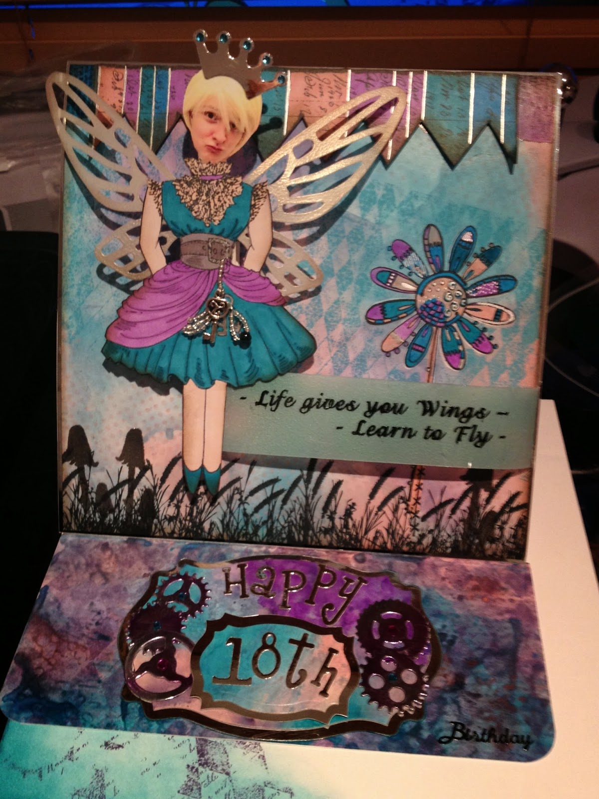
As I have mentioned Caitlin will be 18 this year (scary thought) and of course many of her friends will join her,  although some of her Top Hat (weekend stage school) friends are already 18. Todays offering is the card I did for the friend at Lincoln University.  Like most of Caitlins group she is a thespian and likes things a little over the top so...


I love the sentiment on this as at 18 it is very appropriate 'Life gives you wings, learn to fly'.  the back ground is made with distress inks and overstamped with mushrooms and grasses from Indigo Blu.  The head belongs to the birthday girl and was mounted on a small spring so she can nod to everyone. The wings and crown are from the Tim Holtz die fanciful flight - I think.

A bit of steampunk never goes amiss so the stop for the easel card is decorated with cogs and gears.  The colour scheme is one of my favourites, I love pink and blue but not the pastel kind but strong vibrant colours like picked raspberry and peacock feathers.

Lyn